
Responsiveness is a must quality for any website these days. And all the beginner web developers know that what a chaotic process it is to obtain a desired result.
Bootstrap has been the savior for a long time for developers like us. The most important aspect of Bootstrap is its 12-column mobile first grid system. This is what you use to create a responsive layout using grids.
For better understanding of 12-column mobile first grid system have look at below table from the official Bootstrap website.

Using bootstrap, you can specify different number of column grids based on different screen sizes.
In this tutorial, you will learn to make columns responsive using more than just one column class prefixes to achieve different number of column grids on different screen sizes.
First of all, you need to download the bootstrap from given link:
getbootstrap.com
Now if we want 4 columns for devices with medium screen size, we would use .col-md-4 and it would give us exactly what we asked for:
<div class="row">
             <div class="col-md-4">
                 <img src="images/guy.jpg" alt="box">
             </div>
             <div class="col-md-4">
                 <img src="images/guy.jpg" alt="box">
             </div>
             <div class="col-md-4">
                 <img src="images/guy.jpg" alt="box">
             </div>
             <div class="col-md-4">
                 <img src="images/guy.jpg" alt="box">
             </div>
  </div>
Result:
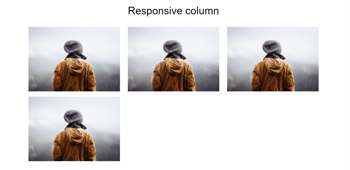
Issue:
Works well in devices having medium screen size, but in large devices the columns would look big and in small devices too small.
Solution:
What most of the beginners don’t know is that we can integrate more than one column types to achieve optimized solution.
Lets say we want 4 columns for large devices, 3 columns for medium devices, 2 columns for small devices (tabloids) and 1 column for mobile devices.
What we do is write this simple piece of code:
<div class="row">
             <div class="col-lg-3 col-md-4 col-sm-6">
                 <img src="images/guy.jpg" alt="box">
             </div>
             <div class="col-lg-3 col-md-4 col-sm-6">
                 <img src="images/guy.jpg" alt="box">
             </div>
             <div class="col-lg-3 col-md-4 col-sm-6">
                 <img src="images/guy.jpg" alt="box">
             </div>
             <div class="col-lg-3 col-md-4 col-sm-6">
                 <img src="images/guy.jpg" alt="box">
             </div>
  </div>
With above piece of code we get what we desired in best possible way. What we have done is defined class prefixes for different screen sizes. In the code above, class prefix col-lg-3 assigns 3 of the 12 available grids to one column, meaning there will be 4 columns in large devices, similarly col-md-4 means 3 columns in devices with medium screen size as 4 * 3 equals 12 and col-sm-6 means 2 columns will be displayed in devices with small screen size and 6*2 equals 12. Pretty neat right?
So, that is all for this tutorial. We will learn more about Bootstrap, columns, layouts and more designing techniques in upcoming tutorial. If you have any problems or comments feel free to comment below. Happy Coding.
This is really helpful man. Keep posting like this.